This redesign was done for a client who was running a recruitment agency and my job was to help them a better website that should align with their brand.
Goal of the project in the client words
Alexander James Recruiting (AJR) is a small UK recruitment agency that specialises in sales roles in vertical markets (industries that are closely related with cross over in skill sets). However, AJR is looking to expand their business in the coming 2 years and need their website redesigned with focuses on several areas.
- Appeal more specifically to those looking to hire a recruiter, this can be broken down into larger businesses who will be more corporate and have a HR department, and smaller businesses whereby they will be interfacing more with the company owners
- Offer more flexibility in the job listings on the site
- Refresh the brand and look and feel to have a more corporate and professional field.
- Whilst retaining the simplicity and ease of use for job seekers two key target audiences are: 1. Those looking to recruit (as defined above) 2. Job seekers – these maybe those activity looking for new jobs or those who are registering their interest / CV to be contacted for future opportunities.
Link of questionnaire if you want to dig further
https://www.dropbox.com/s/z1v5oik2q2zvhnb/AJ%20Recruiting%20Website%20Questionnaire.pdf?dl=0
Why redesign?
Here are few reasons why the client wants a redesign:
- To accelerate our growth in the sectors we work in and are looking to work in.
- To continue and improve the candidate attraction.
- To assist in providing with more infrastructure to bring more clients on board.
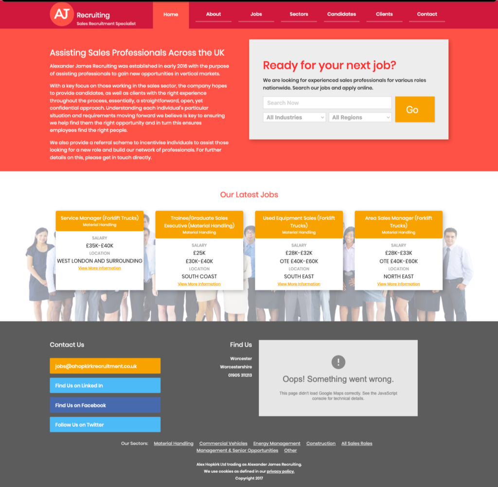
- Last one according to my perspective was website was missing human touch it was more looking like a SAAS website rather than an recruitment agency!

Our goal from redesign!
- Making website user friendly
- Colour schemes should work well
- Making Layout is good
- Dropdown for each section is smooth (maybe there has been some bug in their old site!)
- Contact us Layout at the bottom and the colour scheme with this.
Website theme ideas(pasted directly from clients words)
We like the general look and feel of the existing site; however, we want to modernise and expand it. We would like to stick with the approximate existing colour theme /, however, would like this modernised.
We are looking to strike a balance between a more modern yet straightforward theme. We would like the opportunity for subtle interactions / CSS animations, although nothing over the top.
We want to keep the designs simple (as per the wireframes) to be easily mobile. The wireframes are reasonably modular so that elements can be re-used (within reason) across the subsequent pages.
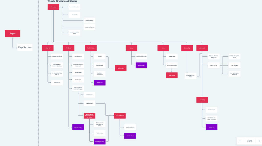
Since this was the redesign, we didn’t have to develop the website’s content, but we have developed the site. So here is the site map link.
https://whimsical.com/sitemap-K3c3kQonGZsNJ32YBudCMt

My process
I didn’t stick to any particular process regarding this redesign because I didn’t have any data except the client goal.
I started to collect inspiration and with the combination of font, colour and layout. And playing with the layout.
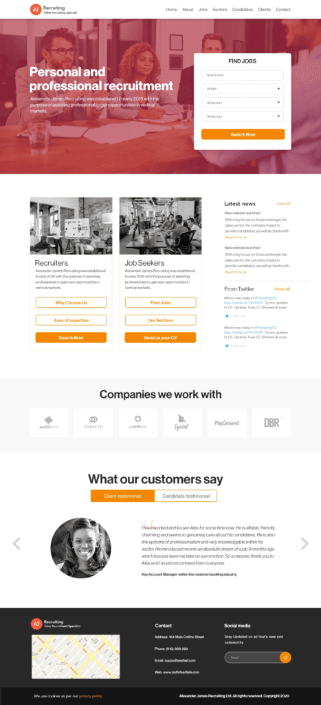
Finally! this is the first version I have come up with!

I have few days of feedback and iteration. This was the final version upon which the client had decided to go with.

.
Click on the image to get a clear view!

Result
The client didn’t share the result with me tough but, he didn’t change the website for the last 2 years so, maybe this is an indication of the in-direct result, but It’s just my assumption.
Live website: https://www.alexanderjamesrecruiting.co.uk/

